
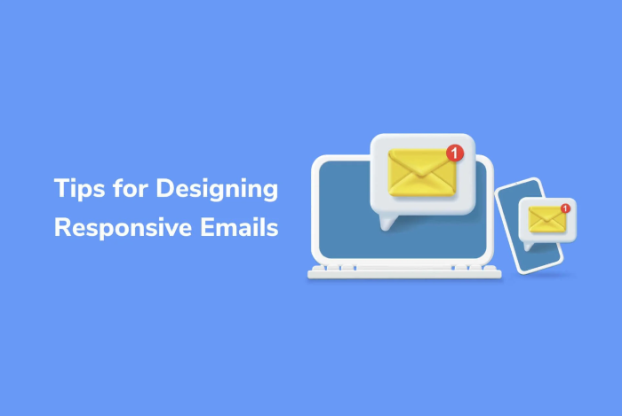
Introduction:
Email marketing remains a potent tool for connecting with your audience in today’s digital landscape. Yet, as we witness the surge in mobile device usage, ensuring your email campaigns seamlessly adapt to both desktop and mobile screens is paramount.
This comprehensive guide will explore the world of responsive email design, offering practical insights and best practices. We aim to assist you in creating emails that captivate your readers and effectively convey your message, regardless of whether they’re viewing it on a computer screen or a handheld device.
Why responsive email design matters:
Responsive email design is not just a trend but necessary for successful email marketing campaigns. Here’s why it matters:
- Mobile Dominance: With most email opens happening on mobile devices, a non-responsive email can result in a poor user experience, leading to lower engagement and conversion rates.
- User Expectations: Modern email recipients expect emails to adapt to their device’s screen size. Your email may appear unprofessional and outdated if it doesn’t meet these expectations.
- Improved Engagement: Responsive emails offer a more engaging and visually appealing experience, which can lead to higher click-through rates and conversions.
- Consistent Branding: A responsive design ensures that your branding elements, fonts, and colors remain consistent across all devices, reinforcing brand recognition.
Now that we have uncovered the importance of responsive email design let’s read into the best practices and tips to help you create stunning email campaigns.
Best Practices for Responsive Email Design:
1. Use a mobile-first approach (mobile optimization)
Start designing your email template with mobile devices in mind. Since mobile screens are smaller, this approach helps prioritize essential content and ensures a seamless user experience on smaller screens. As a bonus, a mobile-optimized email usually translates well to desktop screens.
2. Single column layouts
Opt for a single-column layout for your email. This layout adapts well to various screen sizes and prevents the need for horizontal scrolling. It’s a clean and effective way to present your content.
3. Clear and concise content
Keep your email content concise and to the point. Avoid lengthy paragraphs and use clear headings and subheadings to summarize the text. Use compelling visuals and CTAs to guide the reader’s attention.
4. Responsive images
Use responsive images that automatically adjust to different screen sizes. Include descriptive alt text for images to ensure accessibility for visually impaired subscribers.
5. Fluid design elements
Ensure that your design elements, such as buttons and images, scale proportionally to fit various screen sizes. Use percentage-based widths and heights instead of fixed pixels.
6. Font considerations
Select web-safe fonts that are easily read on desktop and mobile screens. Maintain a legible font size without zooming in on mobile devices.
7. Touch-friendly buttons
Make your buttons large enough to be easily tapped on touchscreens. A minimum size of 44×44 pixels is a good guideline to follow.
8. Testing across devices
Before sending your email campaign, thoroughly test it on various devices and email clients. Tools like PosterMyWall can help you create responsive email designs with their wide range of blog email templates and preview how they will appear on different screens.
9. Fallbacks for email clients
Some email clients may not fully support responsive design features. Provide fallbacks for these clients to ensure your email remains functional and legible.
10. Optimize loading speed
Keep your email’s loading time in check by optimizing images and avoiding excessive media use. Slow-loading emails can deter recipients from engaging with your content.
The importance of visuals:
Visual content is a vital component of responsive email design. Including eye-catching images and graphics can significantly enhance the appeal of your emails. Visuals convey your message, whether it’s product images, infographics, or promotional banners.
Responsive testing tools:
Responsive email design requires thorough testing to ensure compatibility across various devices and email clients. Tools like Litmus and Email on Acid can help you preview your emails on different screens and catch design issues before sending your campaign.
Conclusion:
In the dynamic world of email marketing, responsive email design isn’t a choice; it’s a must. Crafting email campaigns that excel on desktop and mobile screens is vital to connecting with your audience and achieving success in email marketing.
By embracing the best practices detailed in this guide, you can craft captivating and impactful responsive email templates that engage your subscribers. Remember, responsive email design goes beyond aesthetics; it provides a smooth user experience and optimizes your email marketing ROI.
With the right strategies and tools in your toolkit, you can create email campaigns that make a lasting impact and deliver significant results.